Kira
An Australian AI that builds a small business's whole operating system from a few sentences of plain English. Every AI brand is electric blue. This one is on fire.
The product is startling. The category is not: wall-to-wall blue gradients, every AI dressed as the same cold genius. And the buyer isn't a developer. It's a tradie with three staff and a clinic manager who's been burnt by software before. It had to look like the most advanced thing in the room and feel like the warmest.
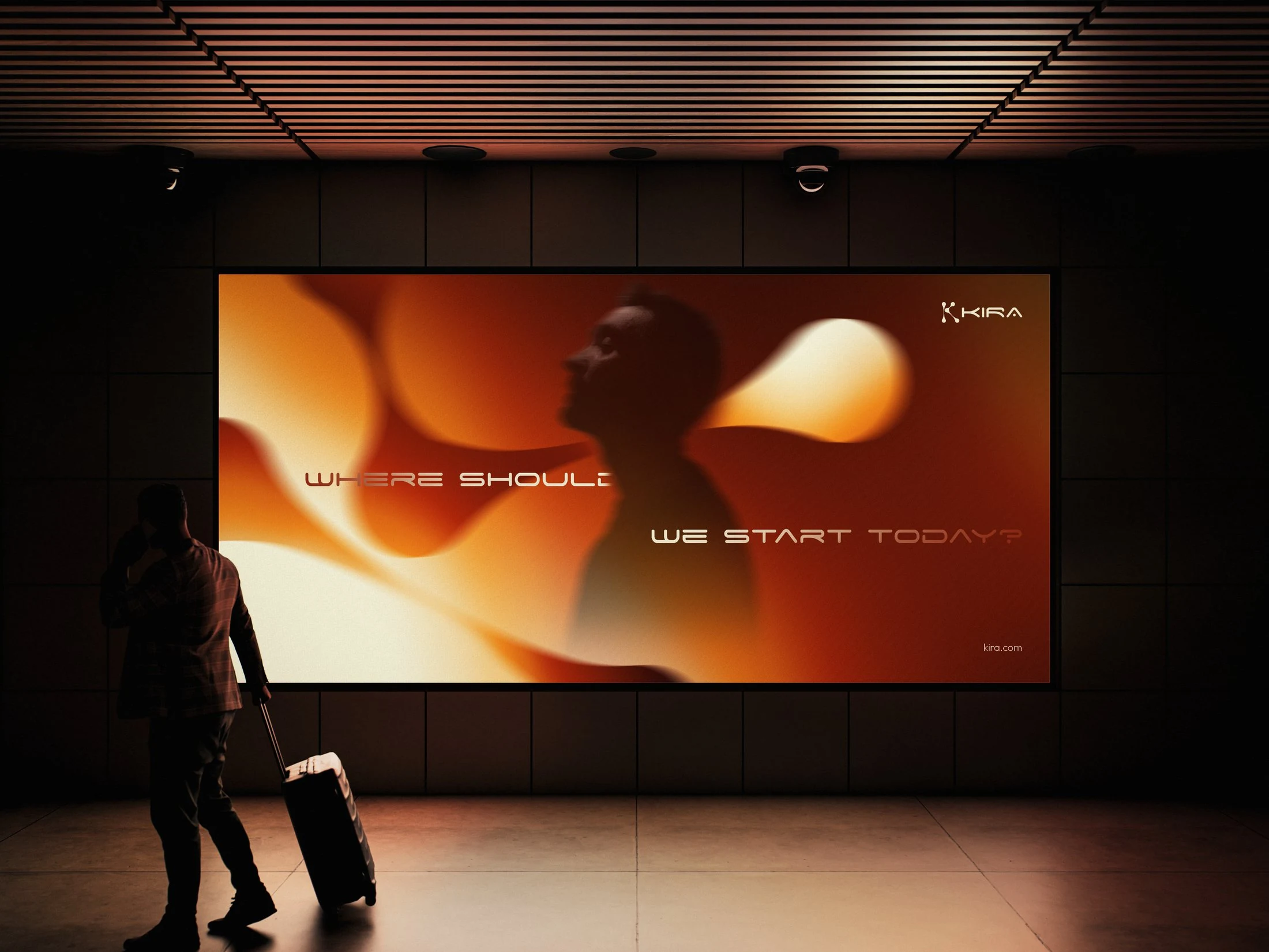
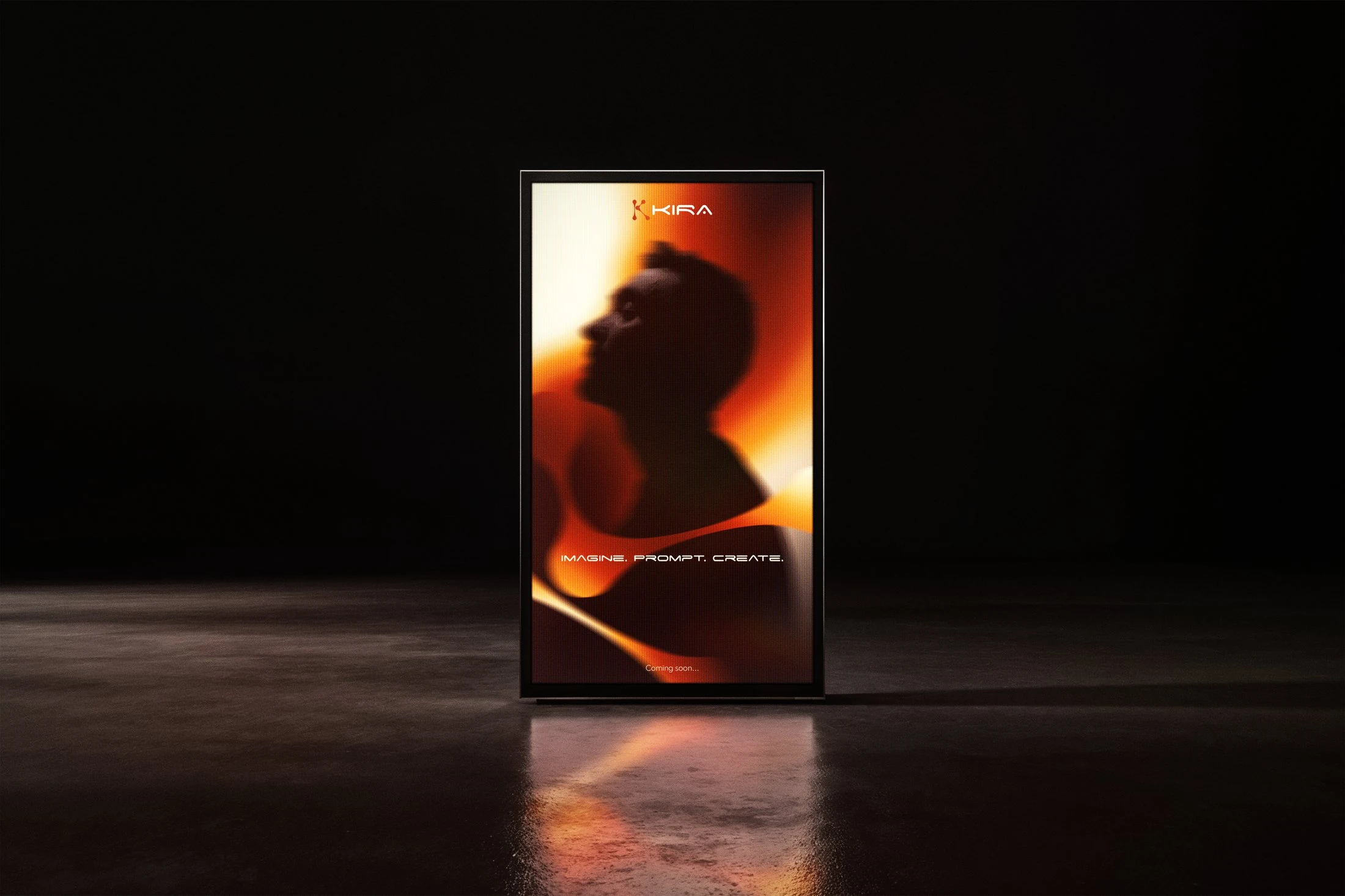
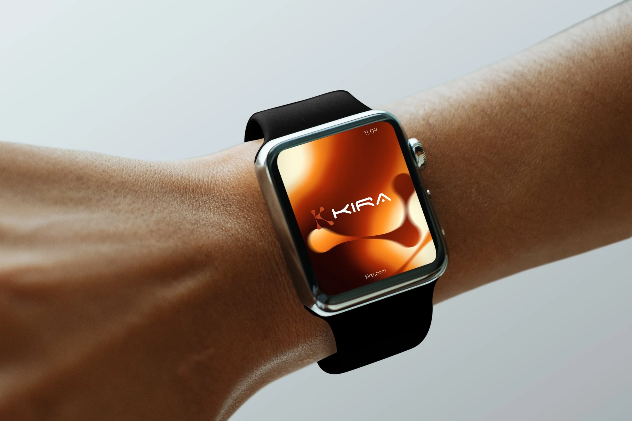
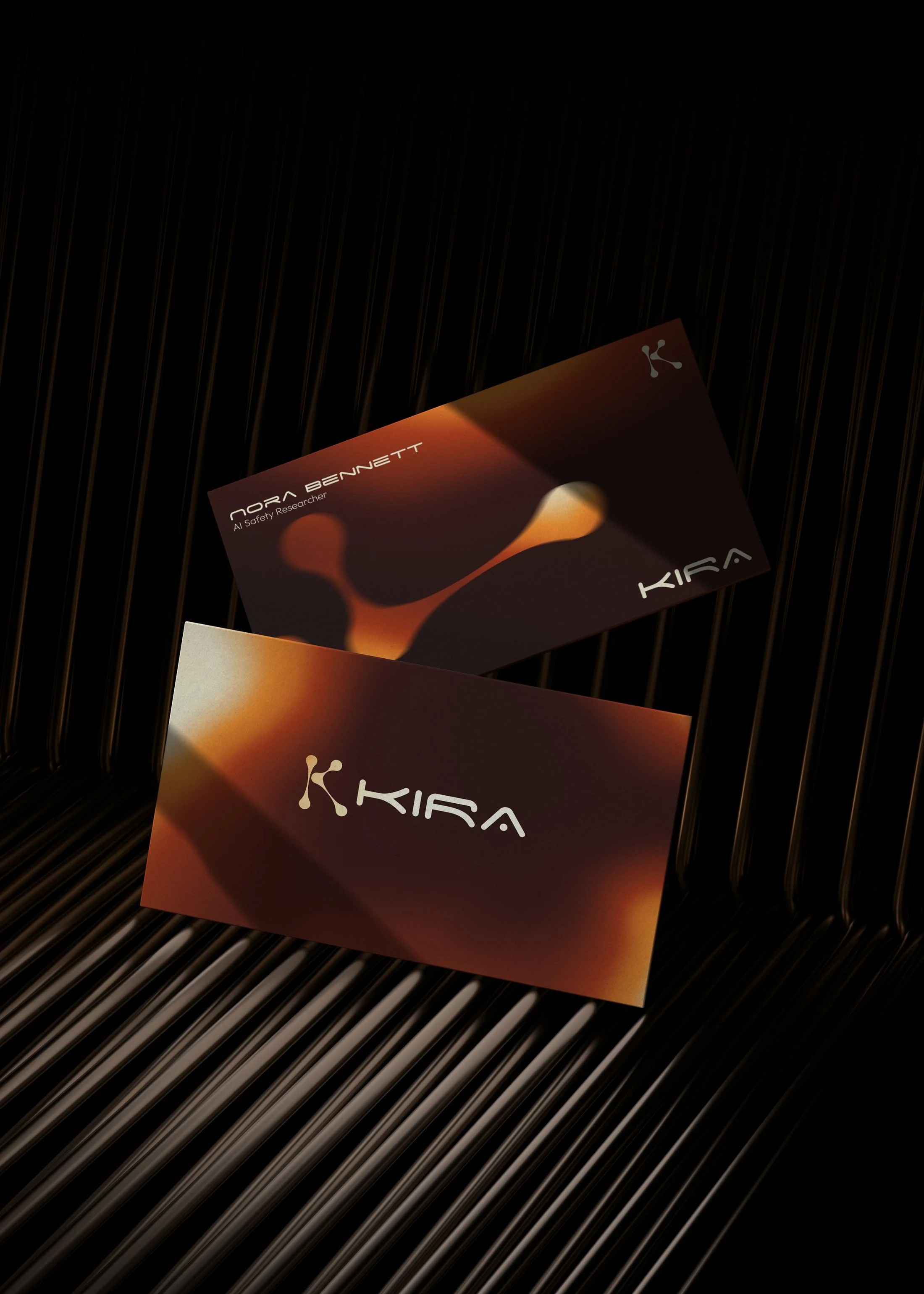
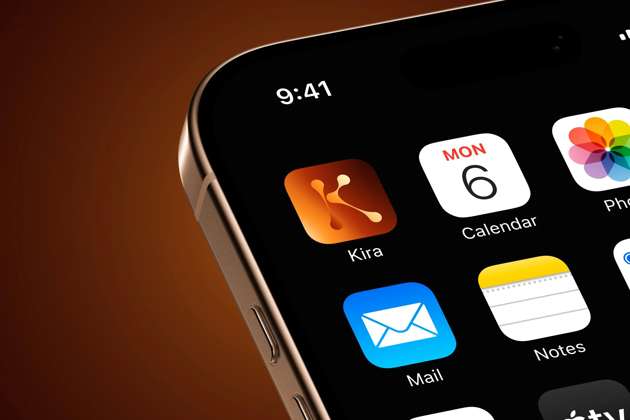
Refuse the category's colour outright. Black for authority, fire for everything else: amber into rust into burgundy. The palette of a forge, not a server room. The name, kira-kira, is Japanese for sparkling: two syllables, reads like a person, types in a second.
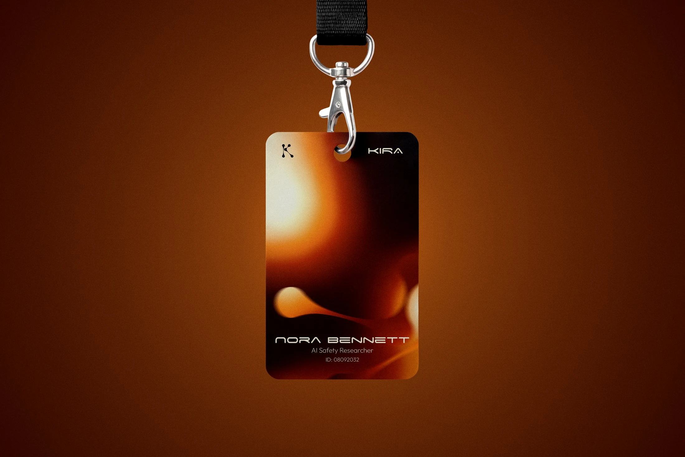
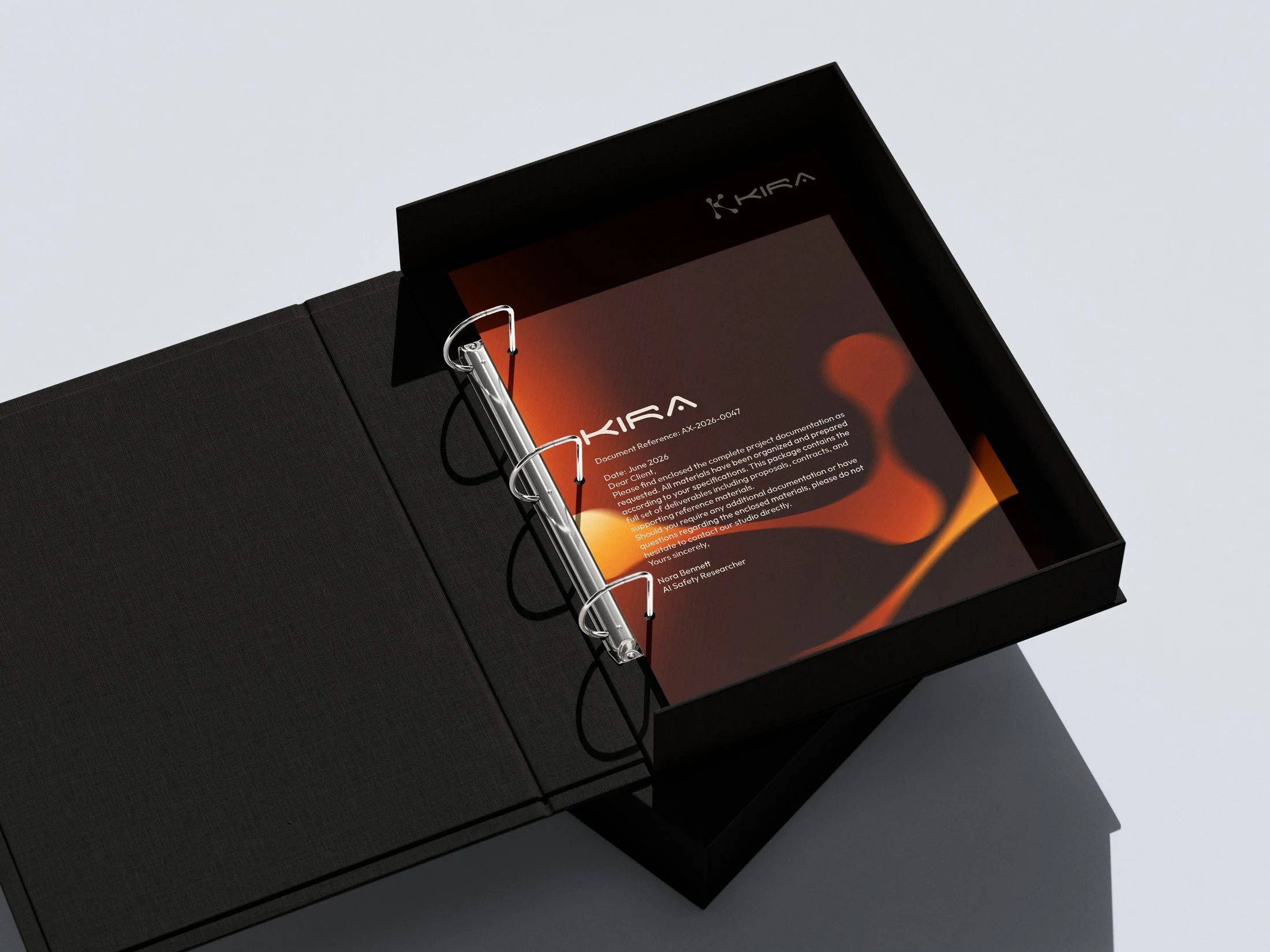
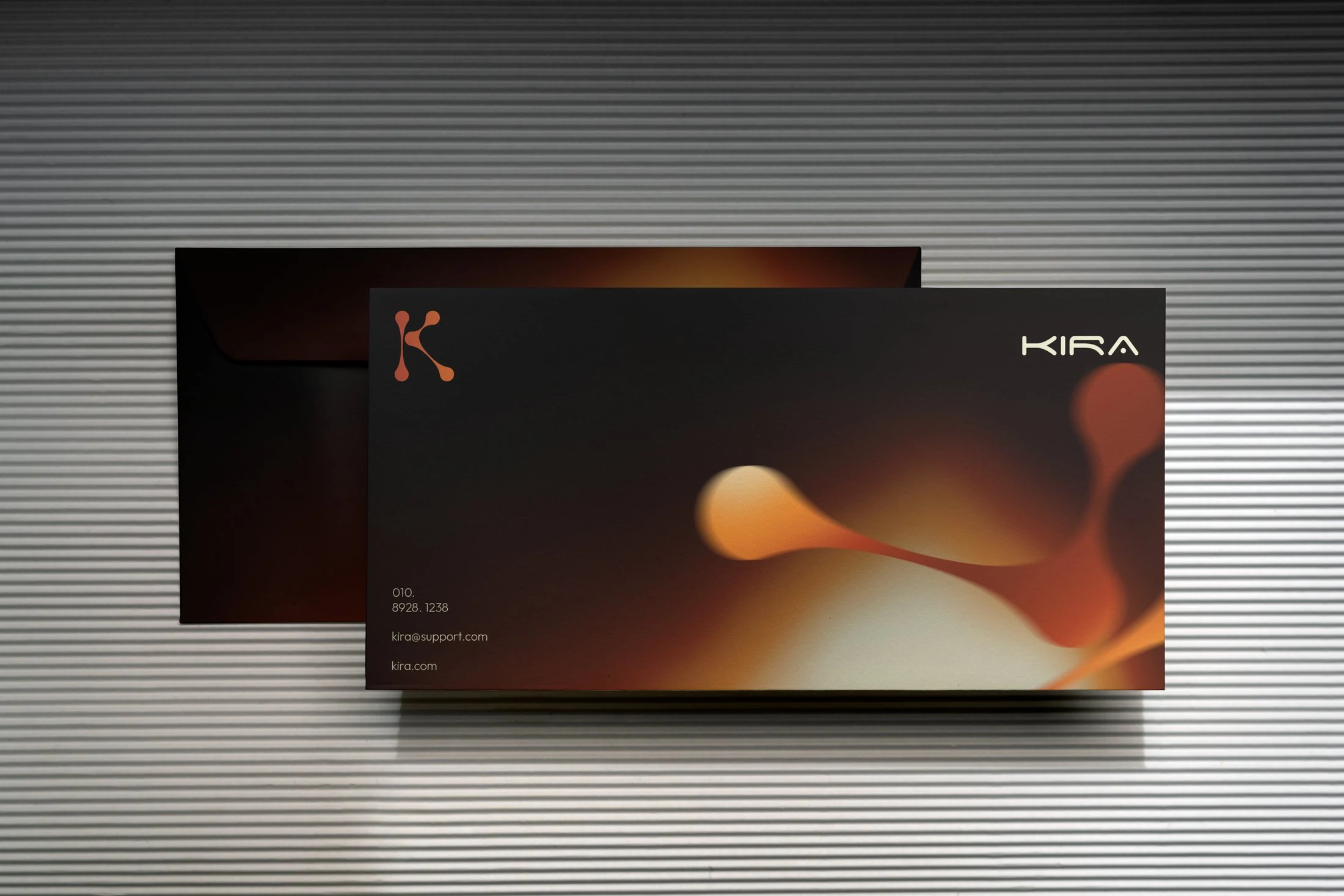
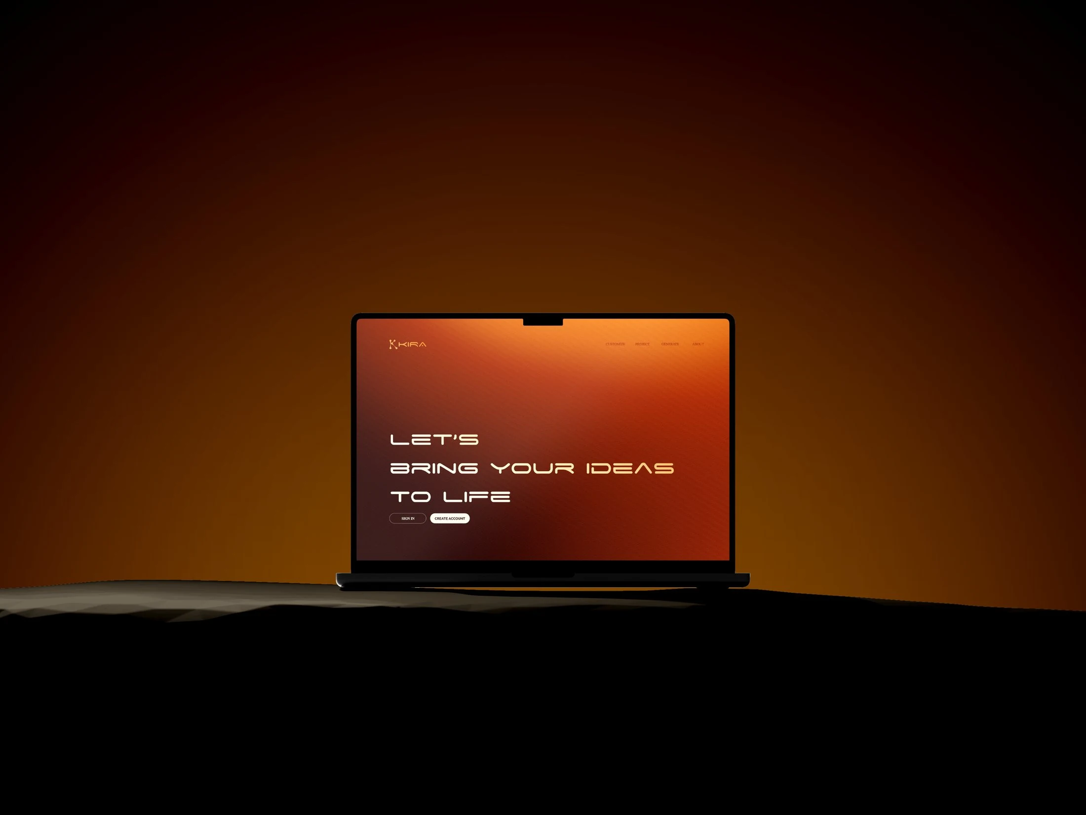
The K is six points of light and the bonds between them, part molecule and part constellation, and it animates the way the product works: nodes first, connections second, meaning last. Eleven touchpoints and ten product screens, all on the same temperature.