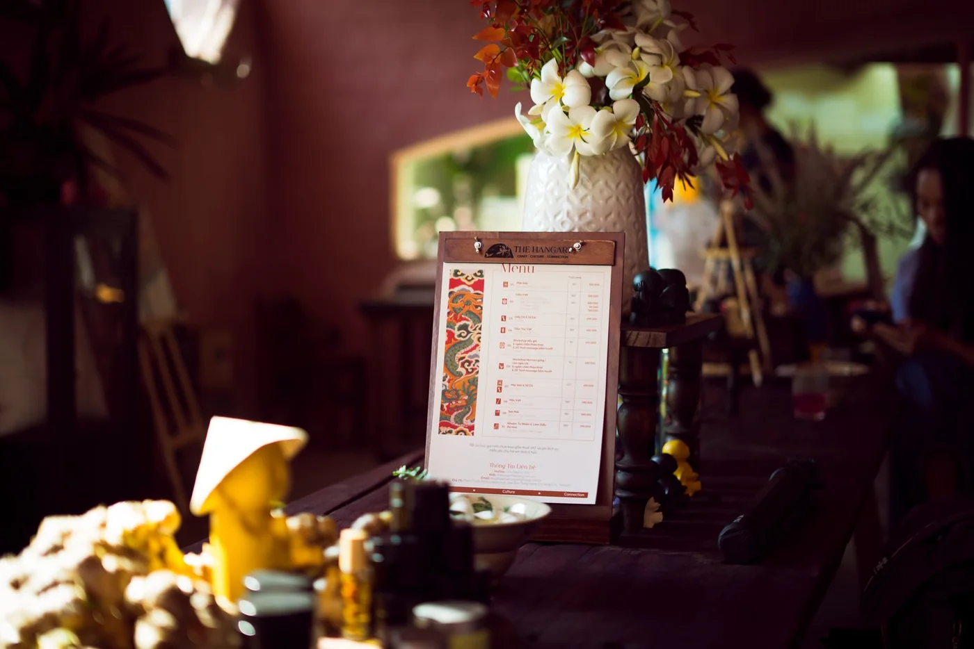
Youth Home
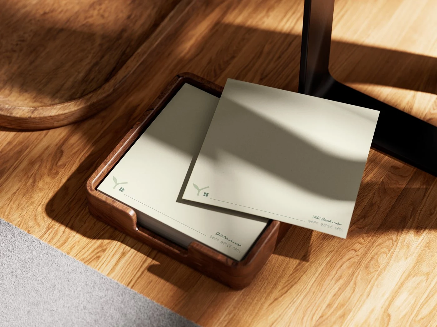
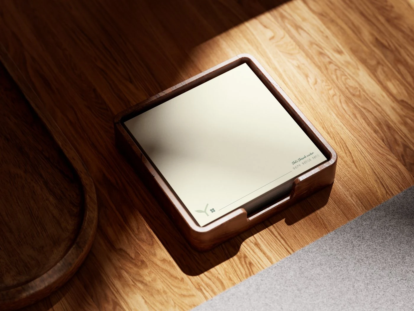
A tea house and social enterprise run by young Deaf makers. Guests order with pen and paper and the tea has no price list. The identity had to be as quiet and as confident as the house.
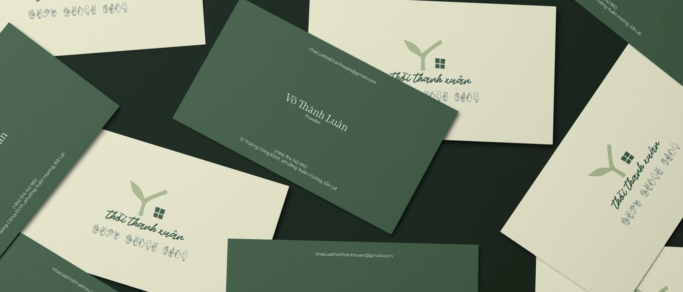
Design for a Deaf-run house and every cliché turns up ready-made: charity beige, pitying copy, a logo that apologises. The opposite was the brief. The soap had to sell because it's good soap, and the tea house had to be found because it's a beautiful tea house.
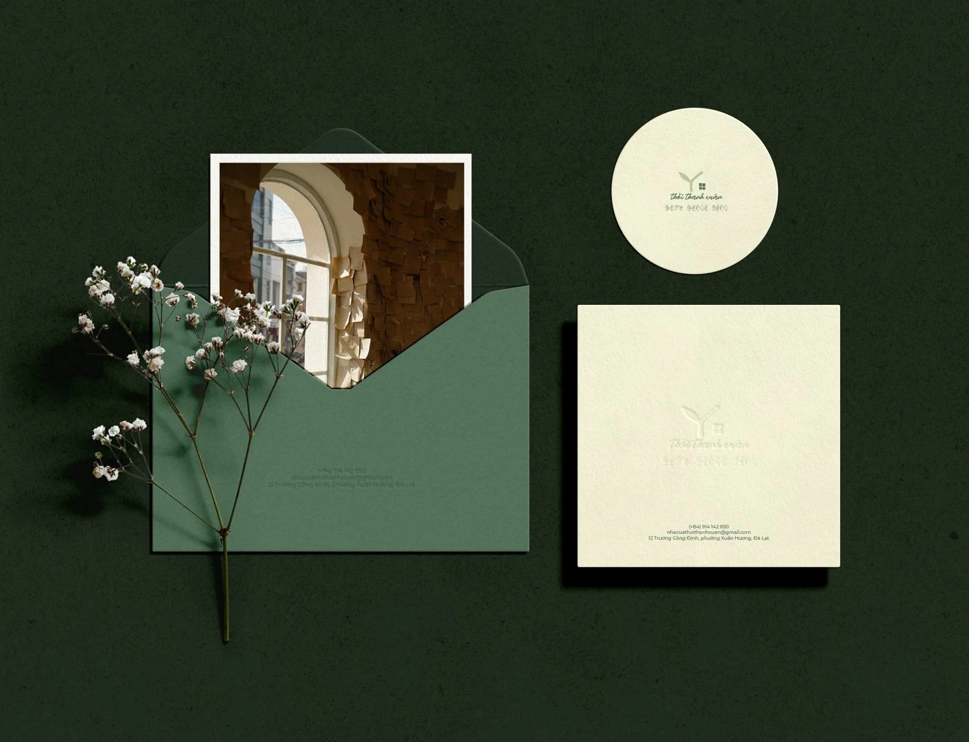
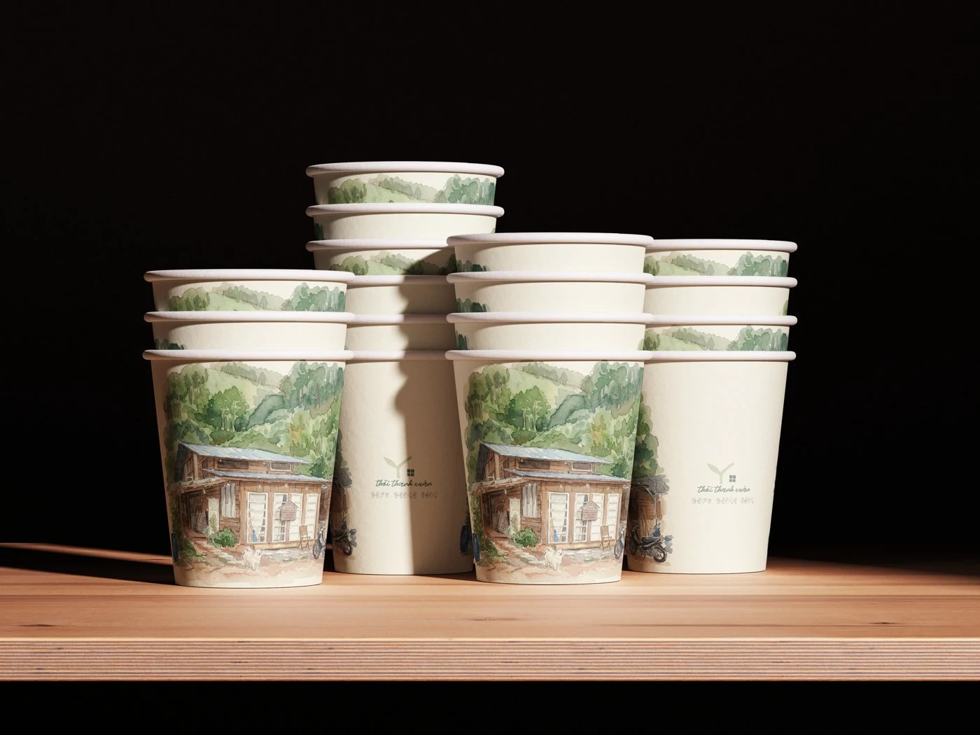
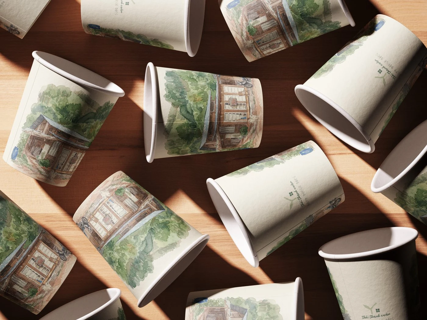
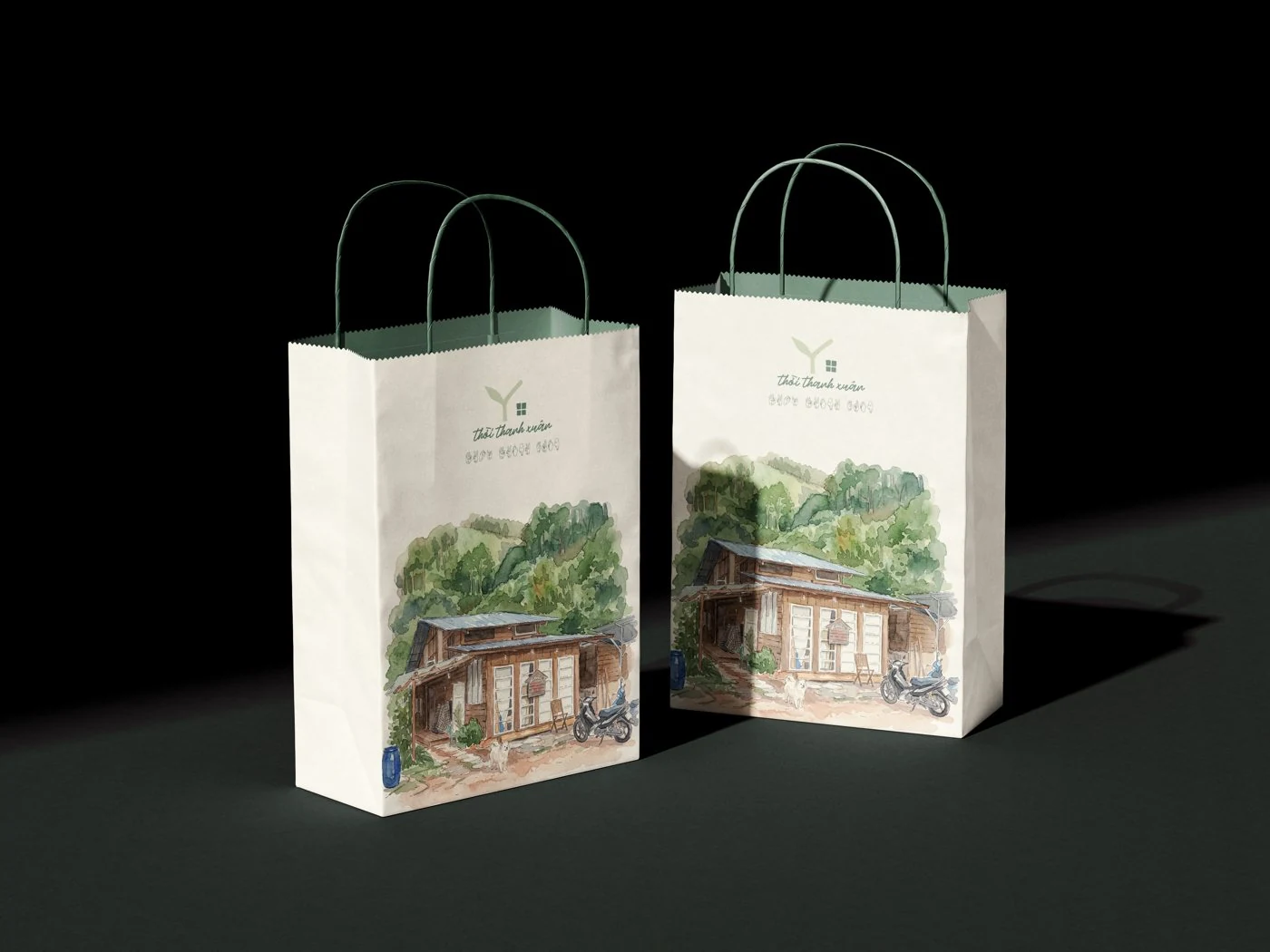
One mark: a sprout with a lit window, the letter Y still growing over a home. Line them up on a shelf of soap or a row of cups and the sprouts become a treeline and the windows become a neighbourhood. Dignity was the strategy. Sympathy never got a look in.
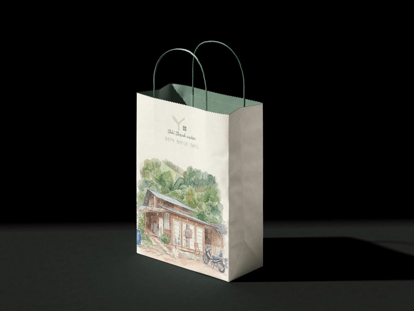
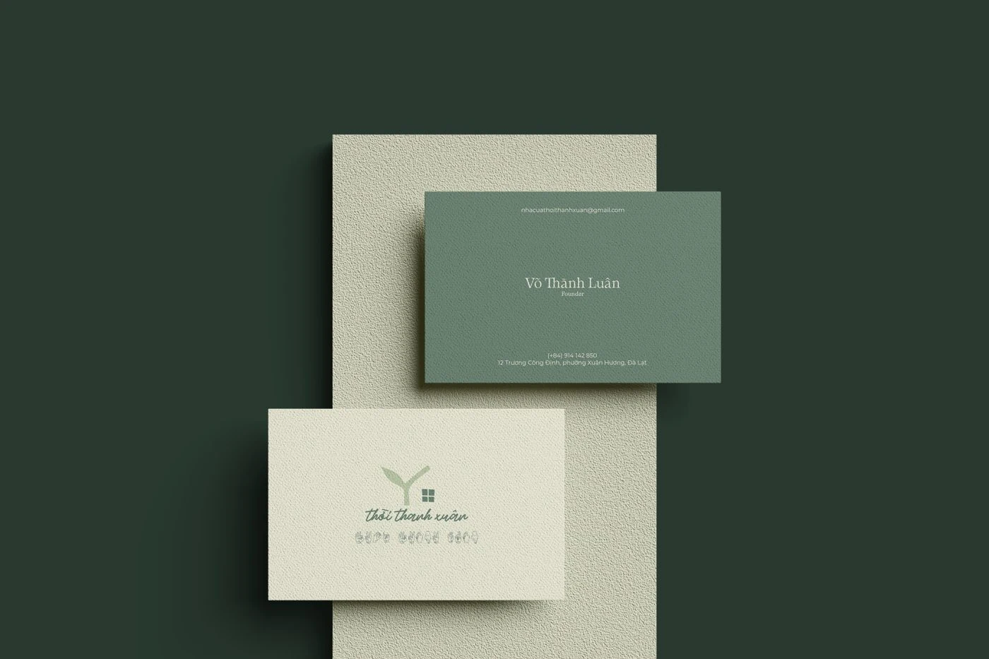
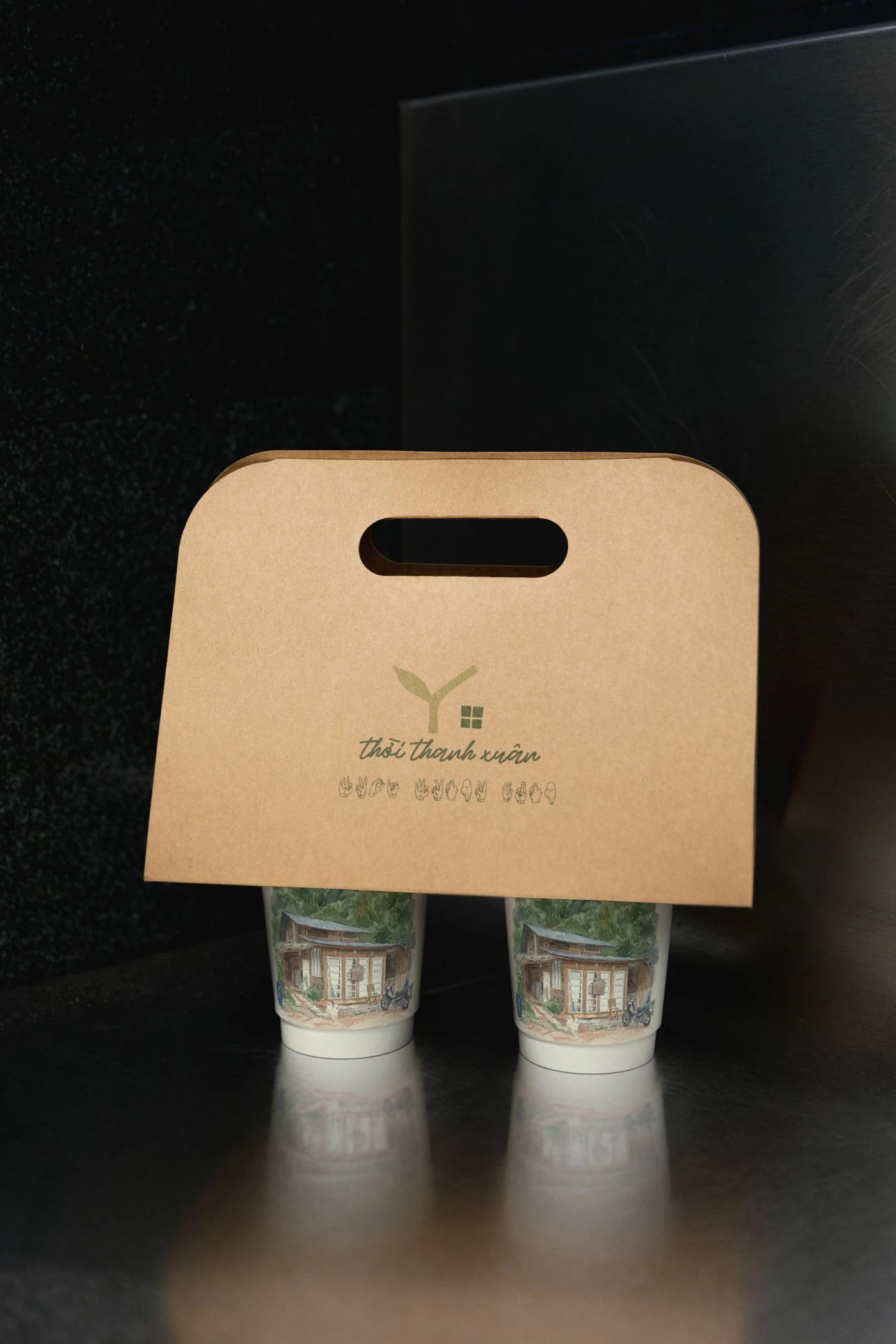
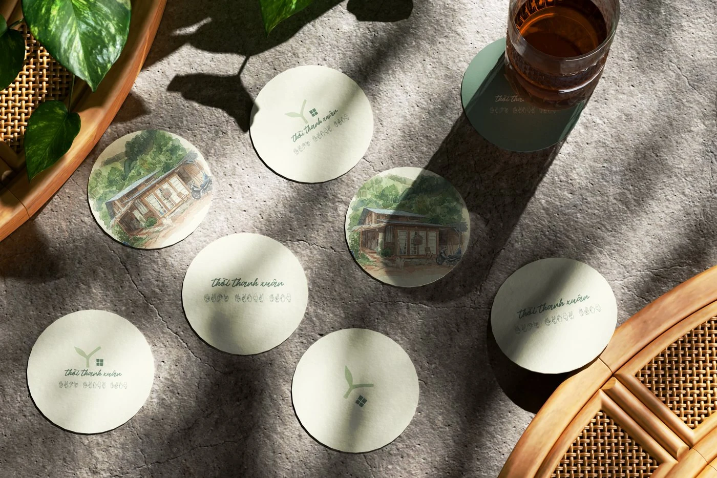
Pine green from the Da Lat hillside, young-bud cream from the sprout, and kraft and timber left unprinted wherever possible. Everything prints one colour at a time, because the house makes things by hand and its stationery shouldn't pretend otherwise.